
Greenpeace
Igniting change in the heat of
the moment.
-
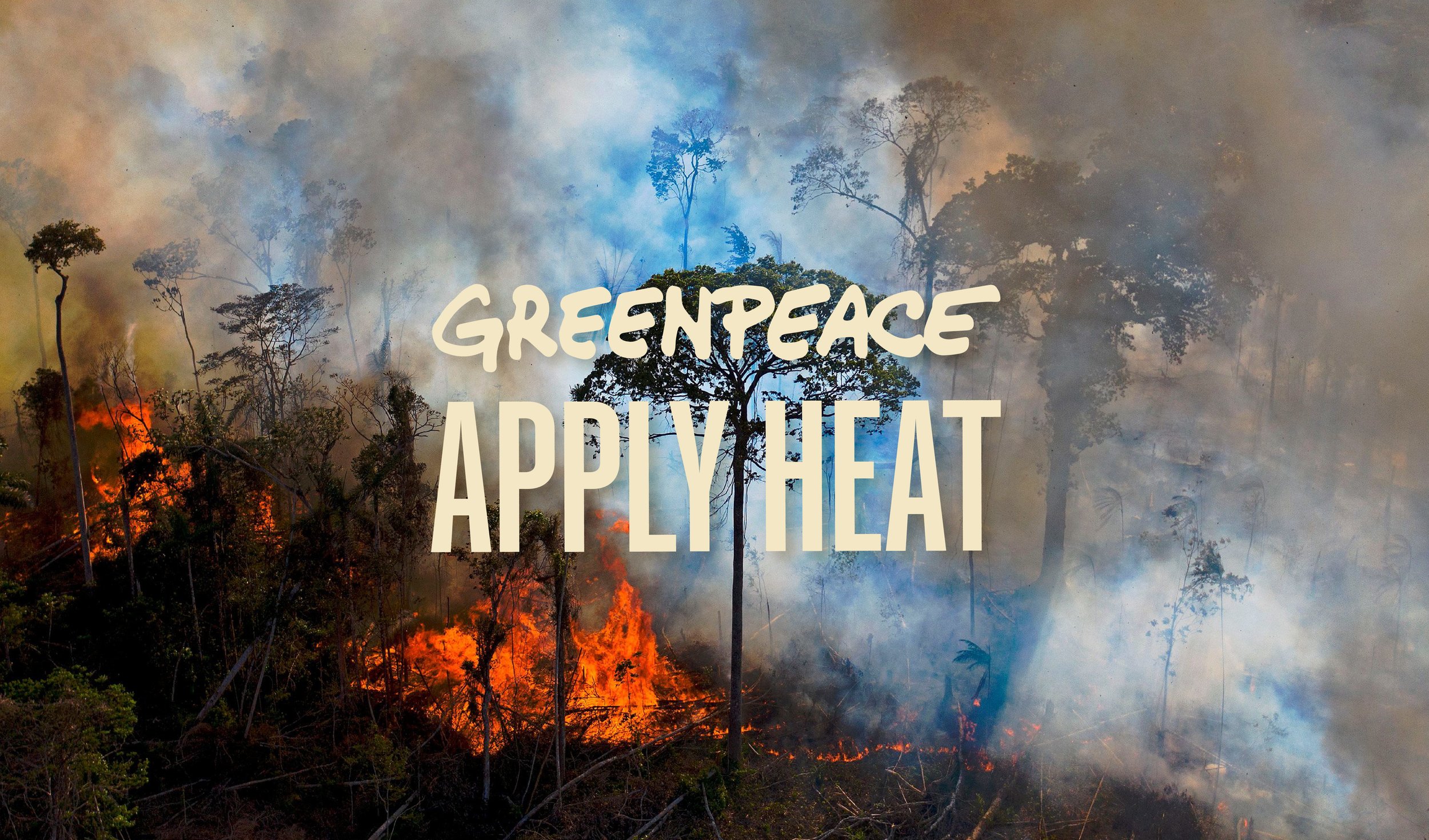
In the midst of the Black Lives Matter movement and the challenges posed by Covid-19, 2020 was a year that shook us all. What particularly struck me was the devastating fires ravaging the Amazon Rainforest. I felt compelled to launch a campaign that brought attention to the distressing number of deliberate fire incidents.
I centered the campaign around thermochromic paper, a material that changes colour in response to heat. Combined with colours reminiscent of the fires and a typeface from a Brazilian foundry, the design choices were deeply rooted in the cause. -
Visual Identity and Campaign Strategy
-
Designer: Tania Harisha (Me)

Rainforest at the heart
The chosen typeface is Mango Sans, a font designed by Brazilian designer Daniel Sabino from Blackletra Type Foundry. The characters are impactful with a strong visual presence bear a striking resemblance to the Amazon Rainforest's towering trees.

Tangible ideas
It was important to explore how this concept could translate to a digital environment. The hands on interaction with the thermochromic paper represented taking responsibility for the Amazon Rainforest's welfare. It emphasised the idea that every individual has a role to play in effecting positive change.
