Stacked
Bringing ASMR sandwich slicing to Stacked’s identity.
-
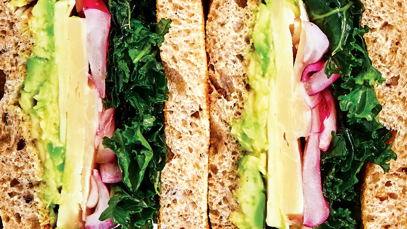
Stacked is a deli truck journeying through London’s bustling streets, needing a distinctive brand identity that uniquely captures the ASMR satisfaction of sandwich slicing while showcasing fresh ingredients. Inspiration for the brief came from @_sensationalsandwiches.
To highlight the ASMR sandwich experience and emphasises freshness, several key visuals were developed. The font 'Obviously' was chosen for its distinctive 'i,' resembling a sandwich being gently compressed. The color palette reflects key ingredients, and the photography features close-up shots to immerse the audience in the sensory appeal of the brand.
-
Brand Identity, Packaging, Creative Direction, Illustration and Social Media
-
Designer: Tania Harisha (Me)
Photography and all rights: Laura Murray

The brand essense
Inspired by the simple satisfaction of slicing into a sandwich and uncovering its layers, I developed a bold, vibrant pattern drawn from the ‘S’ in the logo. It reflects that sense of reveal and texture. The supporting typeface Obviously, was chosen for its playful, distinctive character, especially the quirky ‘i’s and ‘j’s that subtly echo the squish and softness of a well-made sandwich.
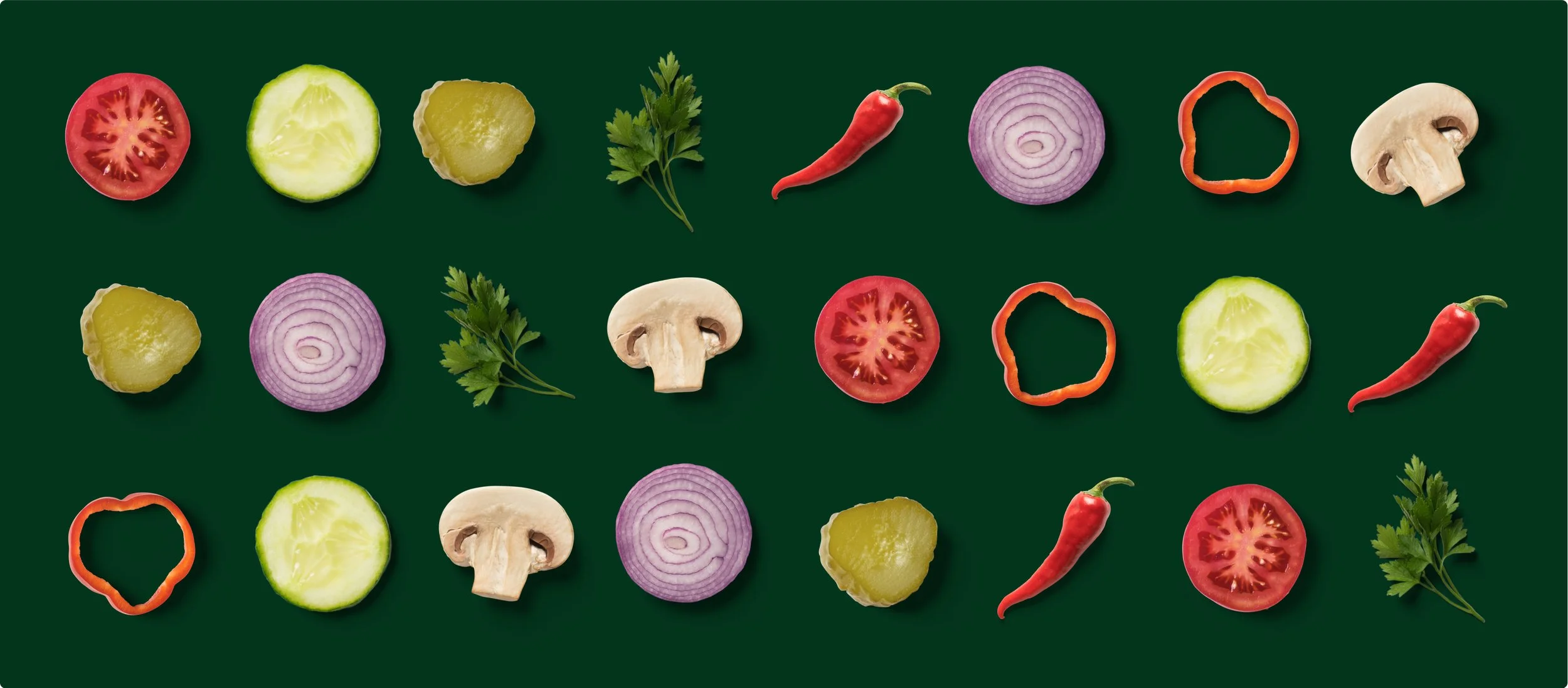

Colours that crunch
The brand’s colour palette pulls inspiration from the ingredients that take centre stage in their sandwiches. Each colour connects to bold, mouthwatering flavours, from rich greens that feel fresh like crisp lettuce to warm browns that nod to crusty ciabatta. It was important that these colours didn’t just reflect the food but also stood out in a crowded market.
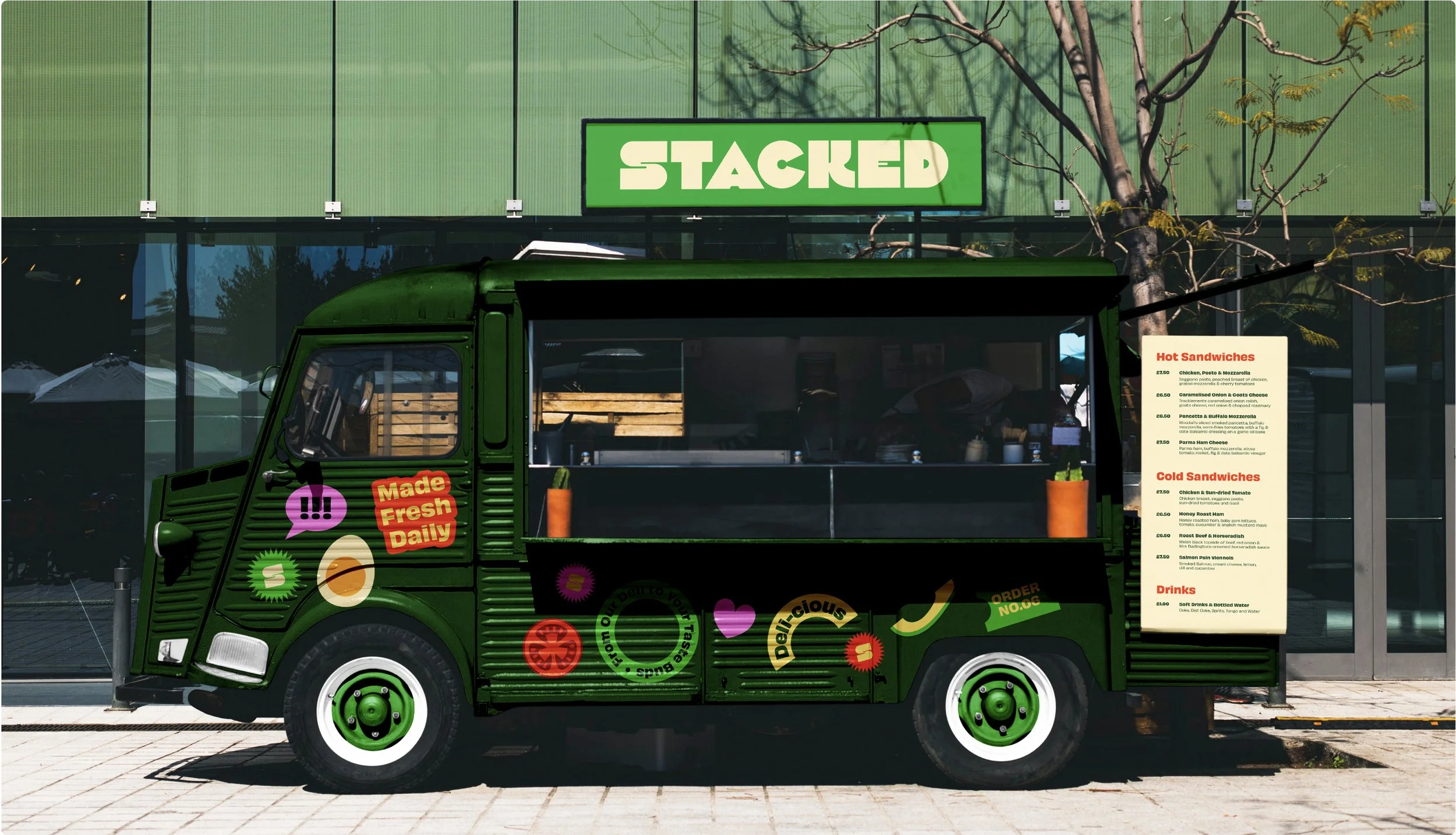


A stand out personality
Each sticker is a canvas for the brand’s bold personality, designed to share its message in a fun, eye-catching way. They’re not just visuals, but little pieces of the brand, sparking curiosity wherever they stick and grabbing the attention of anyone who passes by.


