TikTok Transparency Forum
Designing trust, a safe space for TikTok’s Transparency Forum.
-
TikTok Transparency Forum is a quarterly event dedicated to addressing trust and safety issues on the app. It brings together TikTok experts and industry voices to discuss the ongoing efforts to make TikTok the safest platform for creative expression. TikTok Transparency forum needed a brand Identity that radiated the feeling of safety and approachability.
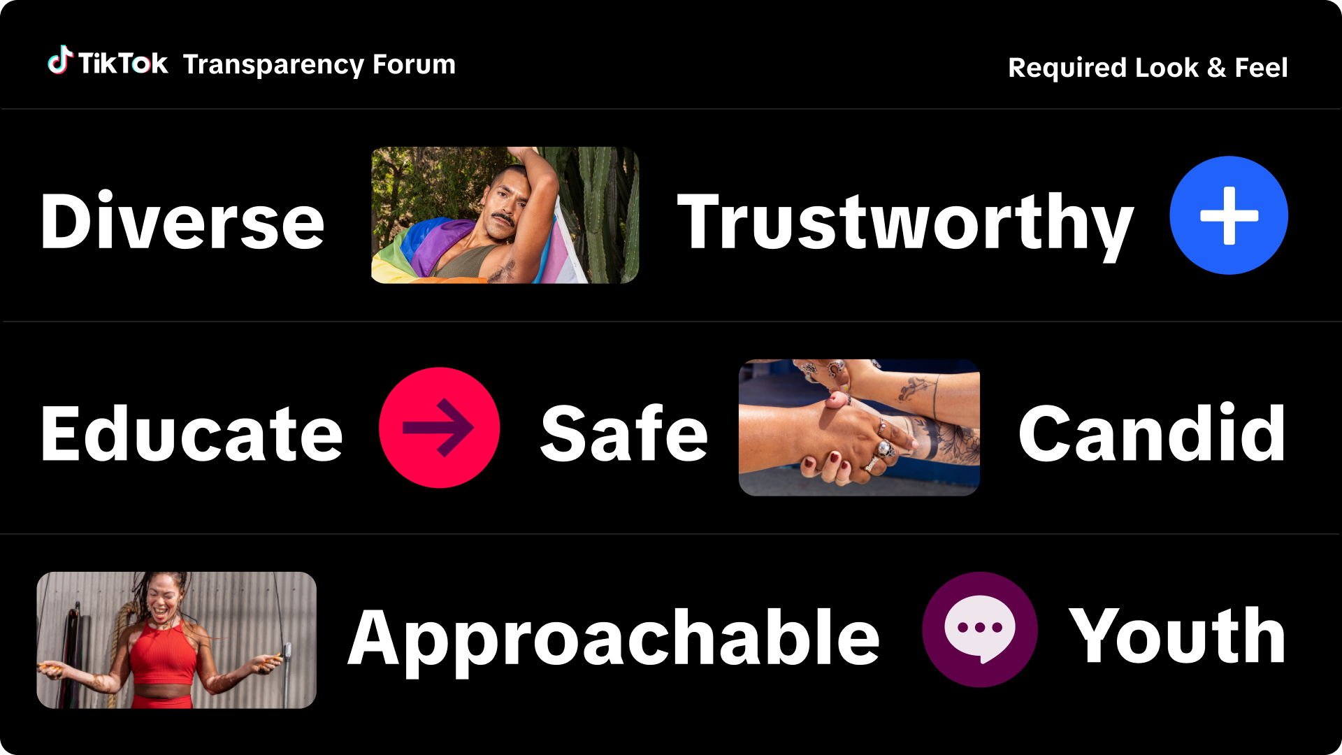
With TikTok’s core branding at the heart of the identity, secondary elements such as colour palettes, transparency elements, and photography were carefully selected to reinforce the core message and evoke a sense of trust and safety. -
Brand Identity, Art Direction, Brand Toolkits, UI and Motion
-
In-House: TikTok
Creative Lead & Designer: Tania Harisha (Me)
A palette with purpose, balancing trust and boldness
During initial in-house discussions, we explored the key attributes the brand should embody. Most importantly, trust and safety. From a creative perspective, TikTok’s core colours felt too bold and needed balance. To achieve this, we introduced a secondary colour palette that harmonised everything seamlessly.

A bold symbol of transparency
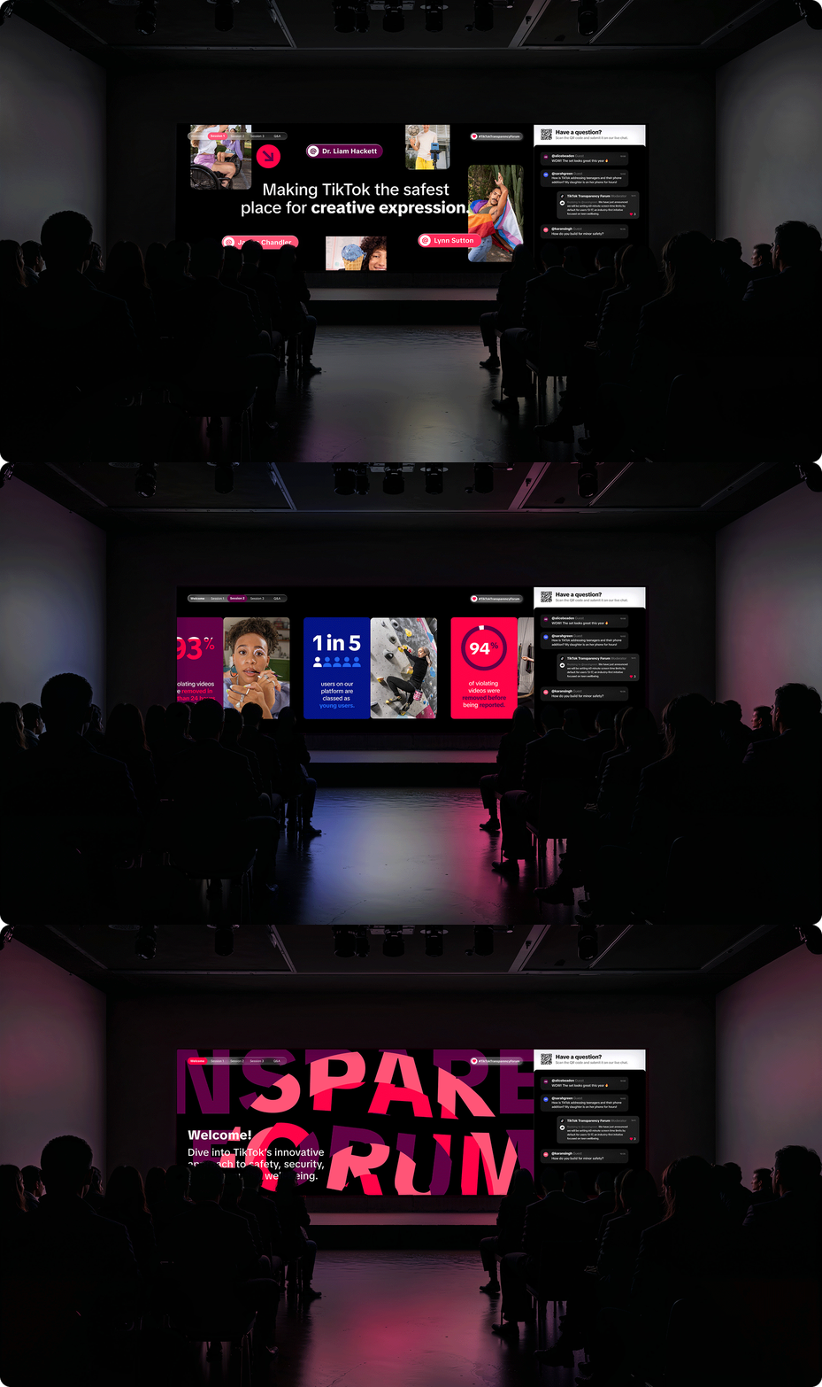
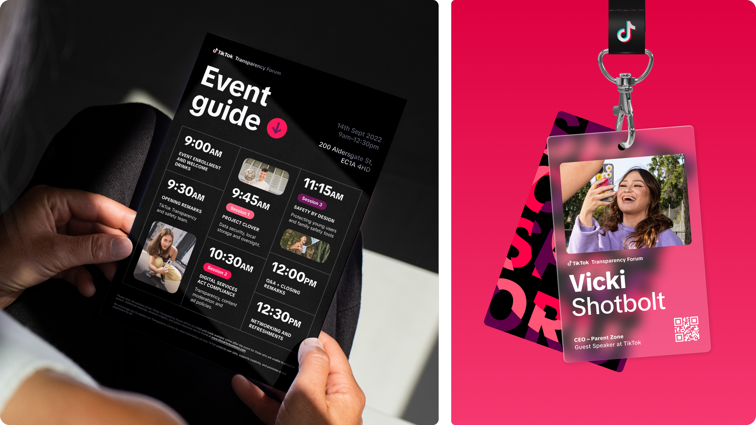
We built the brand around two core expressions of transparency. The first was a glass inspired layer made up of icons and graphic elements that held imagery and copy, creating a sense of clarity and depth. The second was our Transparency Forum pattern, a system of interlocking circles that, when aligned, reveals the event titles with precision. Together, these two visual devices formed a consistent and cohesive thread throughout the entire event experience.


Designed to keep the event sharp.
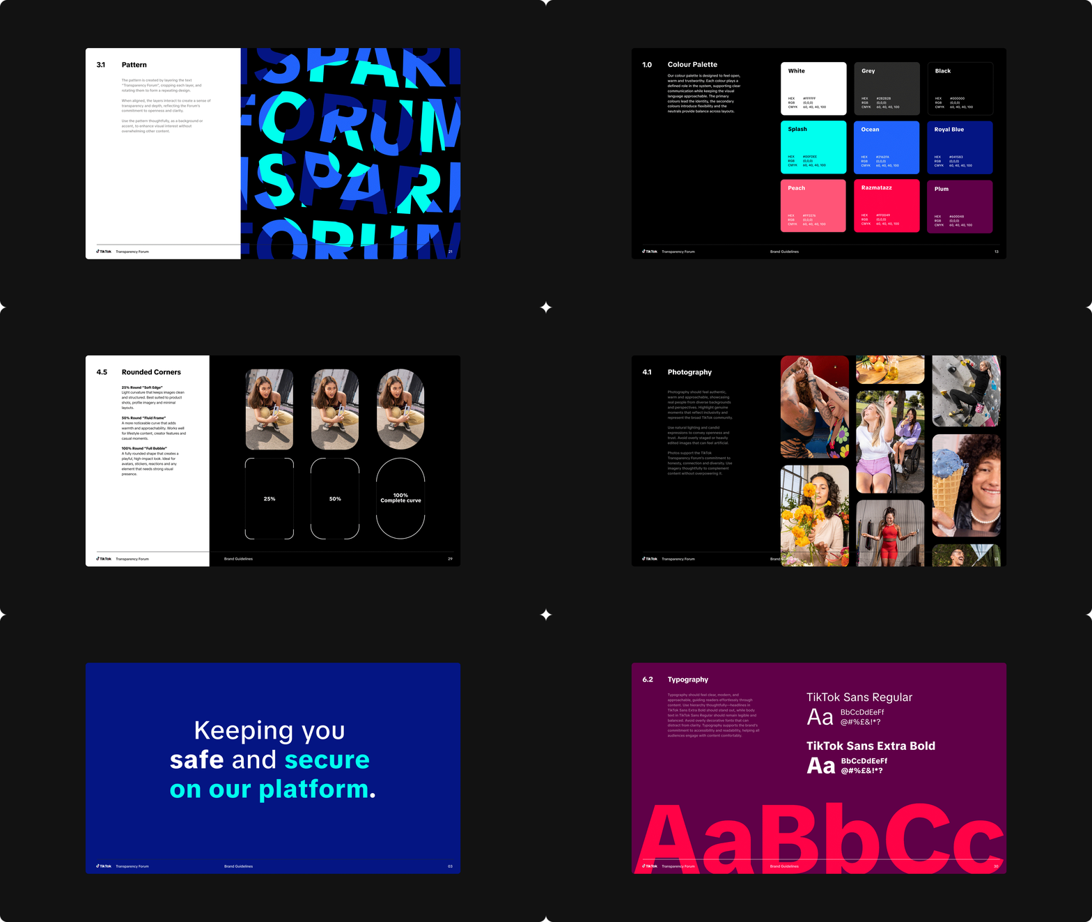
Made for our external events team, SEEN Presents, the brand book is the single source of truth. Delivered as a PDF, it includes clear guidance and practical do’s and don’ts to ensure the brand stays consistent, focused and sharp across every part of the event.